


History On-Line
Brett and Corey are so pleased with the A+ Mr. Hecht gave them on their history essays that they've decided to put the essays on their respective websites.
Brett has a fleur-de-lys crest that she wants to use as a background image and Corey plans to use the French flag as a border. Both can use CSS to position the images and the essays.
Both Brett and Corey can use the stylesheets they created for their printed version of the essays, but they will need to add information to it and change some of the text and font information.
We'll do the harder page first. If the order in which the information is presented seems a bit strange, it's because, while the order isn't necessarily important for a basic webpage, it is important for more advanced page creation. "Look, Ma! No Tables!" covers that information.
Brett's Page
Background Information
Brett has a large jpeg image that she wants to use as a background for her page.

Fleur-de-Lys Background Image
It is 501 pixels wide and 600 pixels high. As you can see, the background of the image is white, so the first thing that Brett will need to do is match the background of her page to the background of her image. That is done like this:
{background-color: #FFF; }
The coding for the background colours is identical to that of the text colours, as we learned in "CSS - Madness or Magic?"
The background image is added to the page like this:
{ background-image: url("fleur2.jpg"); }
There is a bit more to placing a background image onto a page, however. Brett will need to decide how to display the image (either tiled in some manner or as a single image), what direction the tiling, if any, will be, and how the image is to appear in the browser window.
There are four choices for the way a background image will be displayed on a webpage. The images can be repeated horizontally, vertically, or both direction, or there can be no repetition of the image at all. It's done like this:
{ background-repeat: repeat-x; } This creates a horizontal row of images.
{ background-repeat: repeat-y; } This creates a vertical column of images.
{ background-repeat: repeat; } This tiles the images in both directions on a page.
{ background-repeat: no-repeat; } This creates a single image on the page.
Given the size of her image, Brett decides to use the no-repeat option.
The next thing Brett needs to decide is how the image will 'stick' to the page. Will she have it always in the same place in reference to the content? Or will she have it always in the same place in reference to the browser window?
These two commands are written as:
{ background-attachment: fixed;} and
{ background-attachment: scroll; }
While they may sound confusing, "scroll" and "fixed" are really fairly simple. "Fixed" means that the image will always be in the same place, regardless of where a visitor is on the page. To use a printing term, it's like having a letterhead image on only the front page of a report. For example, if Brett's image were 'fixed' to the top of the page, positioned so that it always appeared behind the title, scrolling down the page would mean that the image would eventually 'disappear', just as the letterhead image disappears when you turn the page.
"Scroll", on the other hand, would mean that the image would be in the same place in relation to the window at all times. It's like using paper with a design on it for all the pages of a report. No matter what page you're on, the image behind your text is the same. If Brett's image was set to appear at the top of the page, scrolling down the page would mean that the image would always appear at the top of the window.
After some consideration, Brett attaches her image to the page using 'scroll'. It will always appear on the page.
Now all Brett has to do is decide how to position her image. She has three ways of positioning the background image. She can have it start at a certain percentage of the page from the top and left sides, she can specify a certain number of pixels from the top and left sides, or she can position the image using keywords - top, center and bottom for vertical positioning, and left, center and right for horizontal positioning. The one thing Brett must remember in her positioning is that the first value sets the horizontal position and the second sets the vertical. If only one value is given, that is applied to the horizontal position and the vertical position is assumed to be '50%' or 'center'.
With the large image Brett has, she'll center it on the page, like this:
{ background-position: center; }
There is more positioning information in "Nutshell CSS".
Room For All
Now that Brett has her image properly positioned, she'll need to adjust how the content will sit on the page.
In CSS, this positioning is called the "Box Model". A web page is a 'box', as are the individual sections of the page, and each page/section can be adjusted individually. But first, let's go over the different things that will need to be adjusted.
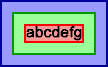
Box Model of Content, Padding, Borders and Margins
In the above image, the 'content', the text, is surrounded by a red border. The enclosed space not only includes the text itself, but the 'leading' of the text, the space between the lines of text, and the 'whitespace' around the edges of all the letters. 'Content' can refer to images as well as text.
The 'padding', the light green area of the box model image, is the amount of space between the 'content' and the 'border' (the dark green line). A padding of "0" means that there is no space between the content and the border.
The border is a line drawn around the edge of the padding. If a border has a width of "0", no border is visible.
Margins are always transparent, just as the margins you set in a word processor are invisible. A margin of "0" puts any enclosed information directly against the sides of the 'box'.
Margin and padding widths are set in a similar manner. Each side can be set individually, or, if all the sides are to be the same width, they can be set using a 'shorthand' version of the code. They are written like so:
{margin-top: 0px; }
{margin-right: 10%; }
{margin-bottom: 1em; }
{margin-left: 10%; }
{padding-top: 3%; }
{padding-right: 3px; }
{padding-bottom: 1%; }
{padding-left: 5em; }
The values used to describe the widths can be entered as specific sizes (10px) or as a percentage of the page (75%). It is permissible to use negative values for margins only. (I'll describe that in "Corey's Page").
The final way to set margins and padding is to write:
{ margin: 0%; } or
{ padding: 5px; }
One value, either a specific distance or a percentage, means that the value will be applied to all four sides. Also, setting margins in CSS is not quite like setting margins in HTML. In HTML, if you set your margins to 100%, the page would fill the screen. With CSS, however, a margin of 100% would put the contents of your page off the screen.
{ margin: 10px 5px; }, or using two values, sets the top and bottom margins to the first value and the left and right margins to the second. This holds true for padding as well.
{ padding: 5px 10px 15px; } sets the padding to 5px for the top, 10px for the left and right sides, and 15px for the bottom. Margins work the same way.
Using four values sets the margins or padding in the following order - top edge, right side, bottom edge and left side.
Borderline CSS
Setting border widths is similar to setting margin and padding widths. There are the same types of choices - "border-top-width", "border-right-width", "border-bottom-width", and "border-left-width" for the individual settings or "border-width" to change all the settings at once. The main difference with borders is that they cannot be set to negative values or to percentages. The width choices are specific widths or keywords - "thin", "medium", or "thick".
But let's get back to what Brett's doing.
She's decided to have the page fill the window with a 3 pixel wide space and no borders. Her code looks like this:
{ margin: 0px }
{ padding: 3px; }
{ border-width: 0px; }
If you specify a border-width without specifying the colour for it, the border will take the colour specified for the text.
Which leads us to our next set of codes. How you specify border colours? Like our last three elements, border colours have choices for the individual borders as well as one for all borders. And, like our previous elements, those borders are read in order as "top, right, bottom, and left". Border colours are set by this code:
{ border-top-color: #hex; }
{ border-right-color: rgb(0,0,0); }
{ border-bottom-color: red; }
{ border-left-color: #hex; } and
{ border-color: green; }
As you can see, the colour value choices are the same as our choices for "color:" and "background-color:".
Brett doesn't have any borders around her page, but she would like to have blue, medium-sized borders around her quoted paragraphs. She also wants the blockquoted sections to have a white background so that they'll stand out from the fleur-de-lys better, and a 5px padding. She can modify the blockquote tag like this:
blockquote { background-color: #FFF; padding: 5px; border-width: medium; border-color: #009; }
Remember the grammar we spoke of in "CSS - Madness or Magic"? This is where it's extremely important to use it. Each section of code, each instruction, is separated from the next by a semi-colon. The element, or section we're changing, is separated from the changed value by a colon.
Brett also has to choose a style of border. Like the others, they can be set indivually ({ border-top-style: choice; }, { border-right-style: choice; }, { border-bottom-style: choice; }, and { border-left-style: choice; }) or collectively ({ border-style: choice; }), and if a style is not selected, then the border width is assumed to be "0". Also, not all browsers render the different choices properly. Regardless of what she may set her borders to look like, they may well show up as 'solid'. So what are the style choices? There are 10 of them.
{ border-style: none; }
{ border-style: invisible; }
{ border-style: dotted; }
{ border-style: dashed; }
{ border-style: solid; }
{ border-style: double; }
{ border-style: groove; }
{ border-style: ridge; }
{ border-style: inset; } and
{ border-style: outset; }
After some thought, Brett adds this code to her blockquote information:
{ border-style: outset; }
One last modification to her stylesheet and she's done. Scripted fonts can be extremely hard to read, and her current blue text will be almost impossible to see against her blue fleur-de-lys. She makes the following changes to the "body" information she already has in her stylesheet:
{ font-family: Arial, Helvetica, sans-serif; font-weight: normal; color: #900; }
The page looks like this.
Corey's Page
Corey, like Brett, plans to add a background image to his page. Unlike Brett, however, he plans to use his as a border. Also, his margin settings, text and borders are different.
Corey's image is the French flag, a gif image 150px wide by 108px high. His entire essay is to have a border, with his quotations in italics. His style is this:
body { text-align: left; text-decoration: none; font-family: "Comic Sans MS", "Bradley Hand", sans-serif; font-size: 11px; font-weight: normal; font-style: normal; color: #003; background-color: #FFF; background-image: url("../images/flag.gif"); background-repeat: repeat-y; background-position: 0px; margin: 10px 50px 10px 150px; padding: 5px; border-width: 6px; border-color: #006; border-style: double; border-left-style: none; }
Also, Cory wants to have his section titles overlap his flag border. His <h2> tag style is:
h2 { text-decoration: underline; margin-left: -50px; }
If you'll notice, Corey has said that there is to be no style on the left border of his page. Had he left the border information as { border-style: double;} without adding the border-left information, the border would have overrun his image and interfered with the section header text. It's set at -50px, remember.
His finished CSS page will look like this.
Now that you know how CSS puts a page together when you have a single page of information, the rest is easy. Just decide on how all the pages will look and write the common things, like fonts, borders and backgrounds on one style sheet.
But there's more. Now that's you've learned what to put on a page, you can learn how to arrange it on a page using CSS in "Look, Ma! No Tables!" (pending).